Note
Go to the end to download the full example code.
Composing plots with a secondary axis
# sphinx_gallery_thumbnail_number = 2
Read in tutorial data and show a summary
This gallery uses the scenario data from the first-steps tutorial.
If you haven’t cloned the pyam GitHub repository to your machine, you can download the file from https://github.com/IAMconsortium/pyam/tree/main/docs/tutorials.
Make sure to place the data file in the same folder as this script/notebook.
import matplotlib.pyplot as plt

import pyam

df = pyam.IamDataFrame("tutorial_data.csv")
df
<class 'pyam.core.IamDataFrame'>
Index:
 * model    : AIM/CGE 2.1, GENeSYS-MOD 1.0, ... WITCH-GLOBIOM 4.4 (8)
 * scenario : 1.0, CD-LINKS_INDCi, CD-LINKS_NPi, ... Faster Transition Scenario (8)
Timeseries data coordinates:
   region   : R5ASIA, R5LAM, R5MAF, R5OECD90+EU, R5REF, R5ROWO, World (7)
   variable : ... (6)
   unit     : EJ/yr, Mt CO2/yr, °C (3)
   year     : 2010, 2020, 2030, 2040, 2050, 2060, 2070, 2080, ... 2100 (10)
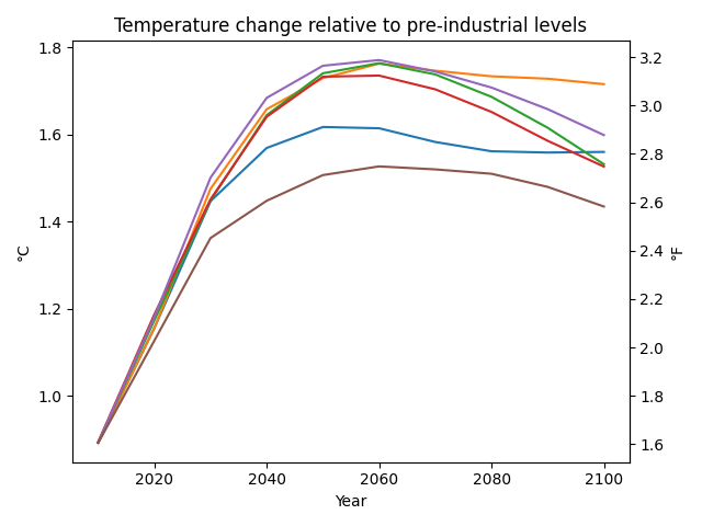
Create a figure with different units on secondary axis
To create a chart with multiple axes, we directly use the matplotlib package
and start with a subplot consisting of a figure canvas and
an Axes object, which contains the figure elements.
First, we generate a simple line chart with temperature increase in °C
for one scenario and multiple models.
We now tell pyam to specifically use the ax instance for the plot.
Then, we create a second axis ax2 using
Axes.secondary_yaxis()
showing temperature increase in °C from the original axis ax
to temperature increase in °F.
fig, ax = plt.subplots()

args = dict(
    scenario="CD-LINKS_NPi2020_1000",
    region="World",
)

temperature = "AR5 climate diagnostics|Temperature|Global Mean|MAGICC6|MED"
title = "Temperature change relative to pre-industrial levels"

data_temperature = df.filter(**args, variable=temperature)
data_temperature.plot(ax=ax, title=title, legend=False)

ax2 = ax.secondary_yaxis("right", functions=(lambda x: x * 1.8, lambda x: x / 1.8))
ax2.set_ylabel("°F")

plt.tight_layout()
plt.show()
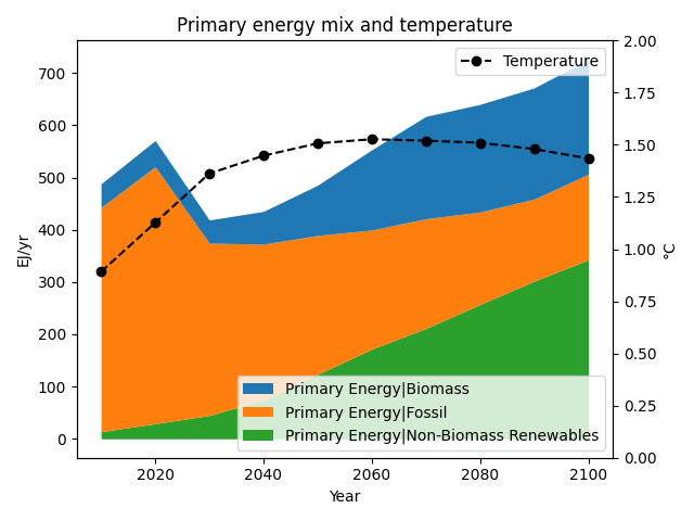
Create a composed figure from several plot types
To create a composed chart, we again use the matplotlib package
and start with a subplot consisting of a figure canvas and
an Axes object, which contains the figure elements.
First, we generate a simple stacked chart
of all components of the primary energy supply for one scenario.
We now tell pyam to specifically use the ax instance for the plot.
Then, we create a second axes using Axes.twinx()
and place a second plot on this other axes.
fig, ax = plt.subplots()

args = dict(
    model="WITCH-GLOBIOM 4.4",
    scenario="CD-LINKS_NPi2020_1000",
    region="World",
)

data_energy = df.filter(**args, variable="Primary Energy|*")
data_energy.plot.stack(ax=ax, title=None, legend=False)

temperature = "AR5 climate diagnostics|Temperature|Global Mean|MAGICC6|MED"
data_temperature = df.filter(**args, variable=temperature)

ax2 = ax.twinx()
format_args = dict(color="black", linestyle="--", marker="o", label="Temperature")
data_temperature.plot(ax=ax2, legend=False, title=None, **format_args)

ax.legend(loc=4)
ax2.legend(loc=1)
ax2.set_ylim(0, 2)
ax.set_title("Primary energy mix and temperature")

plt.tight_layout()
plt.show()
/home/docs/checkouts/readthedocs.org/user_builds/pyam-iamc/checkouts/v3.4.0/pyam/plotting.py:466: FutureWarning: The behavior of array concatenation with empty entries is deprecated. In a future version, this will no longer exclude empty items when determining the result dtype. To retain the old behavior, exclude the empty entries before the concat operation.
  pd.concat([_df, _rows.loc[_rows.index.difference(_df.index)]])
Total running time of the script: (0 minutes 0.383 seconds)