Customizing legends
This is a short tutorial showing how different arguments to the legend keyword in the pyam plotting library affects where the legend is located.
We use the scenario ensemble from the first-steps tutorial (link).
[1]:
from pyam import IamDataFrame
[2]:
df = IamDataFrame(data="tutorial_data.csv").filter(
    variable="Emissions|CO2", region="World"
)

df.head()
[INFO] 16:21:18 - pyam.core: Reading file tutorial_data.csv
[2]:
| model | scenario | region | variable | unit | year | value | |
|---|---|---|---|---|---|---|---|
| 0 | AIM/CGE 2.1 | CD-LINKS_INDCi | World | Emissions|CO2 | Mt CO2/yr | 2010 | 33954.0254 |
| 1 | AIM/CGE 2.1 | CD-LINKS_INDCi | World | Emissions|CO2 | Mt CO2/yr | 2020 | 39274.5709 |
| 2 | AIM/CGE 2.1 | CD-LINKS_INDCi | World | Emissions|CO2 | Mt CO2/yr | 2030 | 36068.4425 |
| 3 | AIM/CGE 2.1 | CD-LINKS_INDCi | World | Emissions|CO2 | Mt CO2/yr | 2040 | 38447.2877 |
| 4 | AIM/CGE 2.1 | CD-LINKS_INDCi | World | Emissions|CO2 | Mt CO2/yr | 2050 | 39519.9596 |
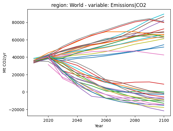
By default, a legend will not appear if there are too many entries.
[3]:
df.plot()
[INFO] 16:21:18 - pyam.plotting: >=13 labels, not applying legend
[3]:
<Axes: title={'center': 'region: World - variable: Emissions|CO2'}, xlabel='Year', ylabel='Mt CO2/yr'>
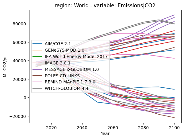
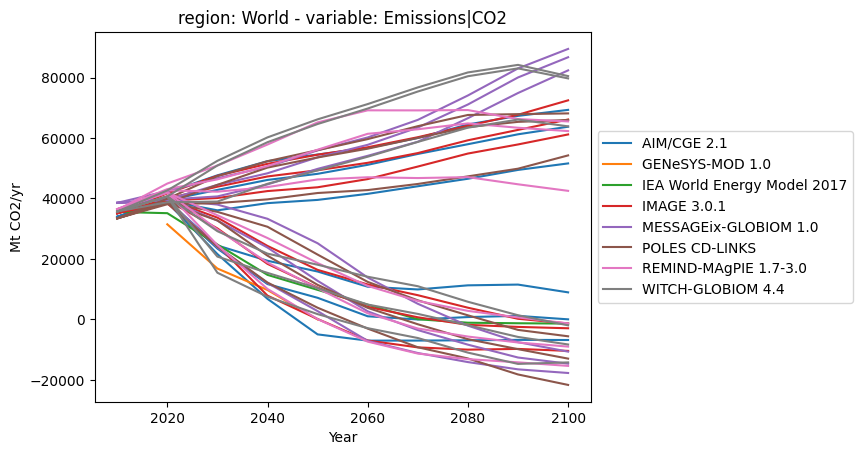
By using the color argument, we tell the pyam plotting library to apply colours by model family. This reduces the number of legend entries (from 38 model-scenario combinations to 8 model families), and the legend will be shown by default with matplotlib standard settings.
[4]:
df.plot(color="model")
[4]:
<Axes: title={'center': 'region: World - variable: Emissions|CO2'}, xlabel='Year', ylabel='Mt CO2/yr'>
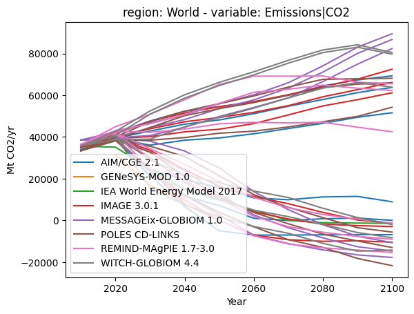
You can use standard matplotlib legend arguments by passing a dictionary of keyword arguments.
[5]:
df.plot(color="model", legend=dict(loc="center left"))
[5]:
<Axes: title={'center': 'region: World - variable: Emissions|CO2'}, xlabel='Year', ylabel='Mt CO2/yr'>
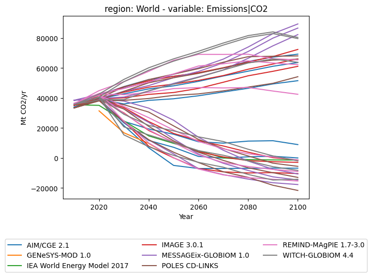
However, we also offer support for a few standard special cases, namely legends to the right of a plot and legends below the plot
[6]:
from pyam.plotting import OUTSIDE_LEGEND
[7]:
df.plot(color="model", legend=OUTSIDE_LEGEND["right"])
[7]:
<Axes: title={'center': 'region: World - variable: Emissions|CO2'}, xlabel='Year', ylabel='Mt CO2/yr'>
[8]:
df.plot(color="model", legend=OUTSIDE_LEGEND["bottom"])
[8]:
<Axes: title={'center': 'region: World - variable: Emissions|CO2'}, xlabel='Year', ylabel='Mt CO2/yr'>