Note
Go to the end to download the full example code.
Stacked line charts
# sphinx_gallery_thumbnail_number = 2
Read in tutorial data and show a summary
This gallery uses the scenario data from the first-steps tutorial.
If you haven’t cloned the pyam GitHub repository to your machine, you can download the file from https://github.com/IAMconsortium/pyam/tree/main/docs/tutorials.
Make sure to place the data file in the same folder as this script/notebook.
import matplotlib.pyplot as plt

import pyam

df = pyam.IamDataFrame("tutorial_data.csv")
df
<class 'pyam.core.IamDataFrame'>
Index:
 * model    : AIM/CGE 2.1, GENeSYS-MOD 1.0, ... WITCH-GLOBIOM 4.4 (8)
 * scenario : 1.0, CD-LINKS_INDCi, CD-LINKS_NPi, ... Faster Transition Scenario (8)
Timeseries data coordinates:
   region   : R5ASIA, R5LAM, R5MAF, R5OECD90+EU, R5REF, R5ROWO, World (7)
   variable : ... (6)
   unit     : EJ/yr, Mt CO2/yr, °C (3)
   year     : 2010, 2020, 2030, 2040, 2050, 2060, 2070, 2080, ... 2100 (10)
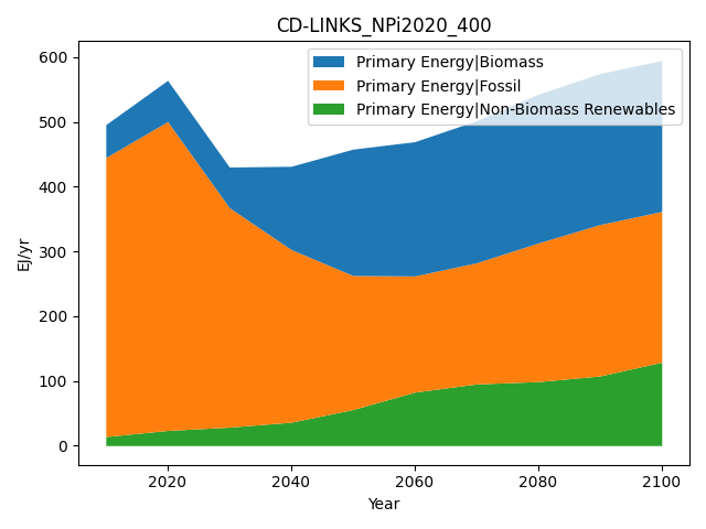
First, we generate a simple stacked line chart of all components of primary energy supply for one scenario.
/home/docs/checkouts/readthedocs.org/user_builds/pyam-iamc/checkouts/latest/pyam/plotting.py:466: FutureWarning: The behavior of array concatenation with empty entries is deprecated. In a future version, this will no longer exclude empty items when determining the result dtype. To retain the old behavior, exclude the empty entries before the concat operation.
  pd.concat([_df, _rows.loc[_rows.index.difference(_df.index)]])
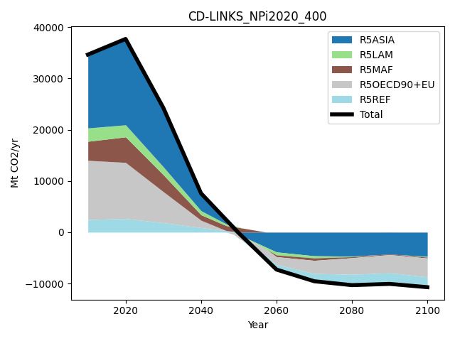
We don’t just have to plot subcategories of variables, any data dimension or meta indicators from the IamDataFrame can be used. Here, we show the contribution by region to total CO2 emissions.
Total running time of the script: (0 minutes 0.275 seconds)