Note
Go to the end to download the full example code.
Stacked bar charts
# sphinx_gallery_thumbnail_number = 4
Read in tutorial data and show a summary
This gallery uses the scenario data from the first-steps tutorial.
If you haven’t cloned the pyam GitHub repository to your machine, you can download the file from https://github.com/IAMconsortium/pyam/tree/main/docs/tutorials.
Make sure to place the data file in the same folder as this script/notebook.
import matplotlib.pyplot as plt

import pyam
from pyam.plotting import add_net_values_to_bar_plot

df = pyam.IamDataFrame("tutorial_data.csv")
df
<class 'pyam.core.IamDataFrame'>
Index:
 * model    : AIM/CGE 2.1, GENeSYS-MOD 1.0, ... WITCH-GLOBIOM 4.4 (8)
 * scenario : 1.0, CD-LINKS_INDCi, CD-LINKS_NPi, ... Faster Transition Scenario (8)
Timeseries data coordinates:
   region   : R5ASIA, R5LAM, R5MAF, R5OECD90+EU, R5REF, R5ROWO, World (7)
   variable : ... (6)
   unit     : EJ/yr, Mt CO2/yr, °C (3)
   year     : 2010, 2020, 2030, 2040, 2050, 2060, 2070, 2080, ... 2100 (10)
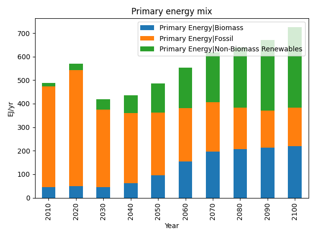
Show stacked bar chart by categories
First, we generate a simple stacked bar chart of all components of primary energy supply for one scenario.
Calling tight_layout() ensures
that the final plot looks nice and tidy.
args = dict(model="WITCH-GLOBIOM 4.4", scenario="CD-LINKS_NPi2020_1000")
data = df.filter(**args, variable="Primary Energy|*", region="World")

data.plot.bar(stacked=True, title="Primary energy mix")
plt.legend(loc=1)
plt.tight_layout()
plt.show()
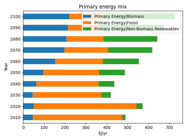
Flip the direction of a stacked bar chart
We can flip that round for a horizontal chart.
data.plot.bar(stacked=True, orient="h", title="Primary energy mix")
plt.legend(loc=1)
plt.tight_layout()
plt.show()
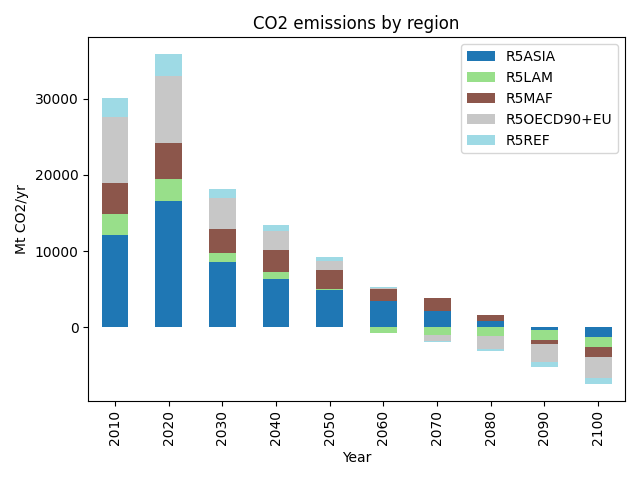
Show stacked bar chart by regions
We don’t just have to plot subcategories of variables, any data or meta indicators from the IamDataFrame can be used. Here, we show the contribution by region to total CO2 emissions.
data = df.filter(**args, variable="Emissions|CO2").filter(region="World", keep=False)

data.plot.bar(
    bars="region", stacked=True, title="CO2 emissions by region", cmap="tab20"
)
plt.legend(loc=1)
plt.tight_layout()
plt.show()
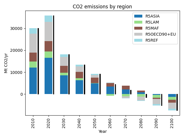
Add indicators to show net values
Sometimes, stacked bar charts have negative entries. In that case, it helps to add a line showing the net value.
fig, ax = plt.subplots()
data.plot.bar(
    ax=ax, bars="region", stacked=True, title="CO2 emissions by region", cmap="tab20"
)
add_net_values_to_bar_plot(ax)
plt.legend(loc=1)
plt.tight_layout()
plt.show()
Total running time of the script: (0 minutes 0.611 seconds)