Note
Go to the end to download the full example code.
Ranges of timeseries data
# sphinx_gallery_thumbnail_number = 3
Read in tutorial data and show a summary
This gallery uses the scenario data from the first-steps tutorial.
If you haven’t cloned the pyam GitHub repository to your machine, you can download the file from https://github.com/IAMconsortium/pyam/tree/main/docs/tutorials.
Make sure to place the data file in the same folder as this script/notebook.
import matplotlib.pyplot as plt

import pyam

df = pyam.IamDataFrame("tutorial_data.csv")
df
<class 'pyam.core.IamDataFrame'>
Index:
 * model    : AIM/CGE 2.1, GENeSYS-MOD 1.0, ... WITCH-GLOBIOM 4.4 (8)
 * scenario : 1.0, CD-LINKS_INDCi, CD-LINKS_NPi, ... Faster Transition Scenario (8)
Timeseries data coordinates:
   region   : R5ASIA, R5LAM, R5MAF, R5OECD90+EU, R5REF, R5ROWO, World (7)
   variable : ... (6)
   unit     : EJ/yr, Mt CO2/yr, °C (3)
   year     : 2010, 2020, 2030, 2040, 2050, 2060, 2070, 2080, ... 2100 (10)
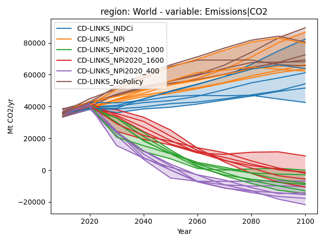
Highlighting ranges in a line chart
In this example, we want to highlight the range across a scenario ensemble. We do this by utilizing the fill_between argument.
data = df.filter(scenario="CD-LINKS*", variable="Emissions|CO2", region="World")

data.plot(color="scenario", fill_between=True)
plt.tight_layout()
plt.show()
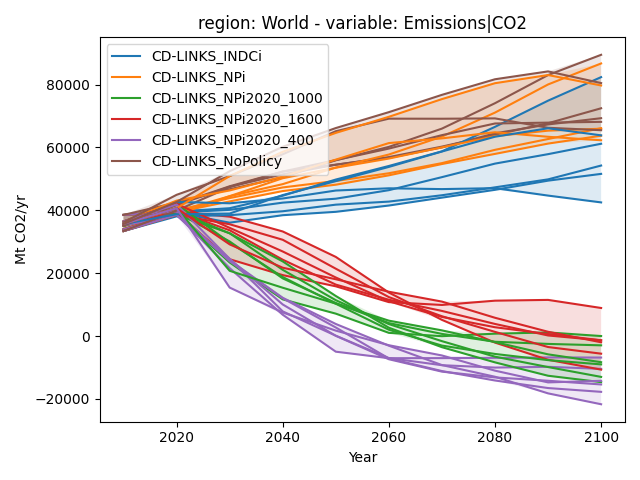
More options for highlighting ranges in a line chart
The keyword argument fill_between can be set to true, or it can be provided specific arguments as a dictionary: in this illustration, we choose a very low transparency value.
data.plot(color="scenario", fill_between=dict(alpha=0.15))
plt.tight_layout()
plt.show()
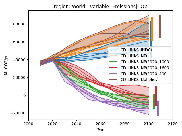
Even more options for highlighting ranges in a line chart
To further highlight the range of data, we can also add a bar showing the range of data in the final time period using final_ranges. Similar to fill_between it can either be true or have specific arguments.
data.plot(color="scenario", fill_between=True, final_ranges=dict(linewidth=5))
plt.tight_layout()
plt.show()
Total running time of the script: (0 minutes 0.990 seconds)